.jpeg)
System failures don't announce themselves.
While some teams scramble to fix critical bugs discovered by frustrated users, others maintain seamless operations through strategic quality assurance frameworks.
For technology directors managing complex enterprise applications, the difference often comes down to investing in the right enterprise quality assurance tools.
Development teams who successfully navigate major platform migrations without critical production incidents aren't just lucky. They implement robust QA processes and enterprise software testing tools that catch issues before they reach production.
How can you ensure your QA process is effective when technology keeps evolving at breakneck speed?
Use enterprise quality assurance tools that combine proven methodologies with automation, AI insights, and cloud-based scalability to address complex enterprise development challenges.
But before we get into that:
-------------------------------------
Looking For A QA Checklist Template With Examples?
Get Our QA Checklist Right Here
--------------------------------------
Got it? Okay let's continue.
The Industry Is Changing
The software quality game has completely shifted since 2020, accelerated by remote work, cloud-first architectures, and the explosive growth of AI-driven development.
Traditional waterfall QA approaches – where testing happened at the end of development cycles – have become as obsolete as flip phones in an iPhone world.
Enterprise software testing tools now need to support continuous testing for enterprise environments, where code deploys happen multiple times per day rather than quarterly releases.
Development teams are embracing shift-left testing methodologies, integrating quality checks directly into enterprise CI/CD integration testing pipelines and catching issues during the coding phase rather than after integration.
Enterprise QA frameworks must now accommodate test automation at scale, supporting thousands of concurrent test executions across distributed environments while maintaining consistent performance and reliability.
AI is fundamentally transforming QA roles and processes. Modern QA automation for enterprises leverages machine learning to:
- Generate test cases automatically based on user behavior patterns and code changes
- Predict which areas of code are most likely to contain bugs using historical data analysis
- Self-heal test scripts when UI elements change, reducing maintenance overhead
- Provide intelligent test coverage recommendations to optimize testing efficiency
This evolution means QA professionals are shifting from manual test execution to strategic test orchestration, focusing on test design, automation framework architecture, and quality metrics analysis rather than repetitive manual verification tasks.
Enterprise Quality Assurance vs. Quality Tools
Most technology leaders think they can solve quality problems by buying better tools.
They can't.
Tools are only as effective as the processes and frameworks that govern them, which is why so many expensive QA tool implementations end up gathering digital dust while teams go back to their old workflows.
What Is Enterprise Quality Assurance?
Enterprise quality assurance refers to the comprehensive methodology, processes, and organizational practices that ensure software quality across large-scale, complex systems. This includes:
- Test strategy development and governance frameworks
- Compliance management and audit trail maintenance
- Cross-team coordination and communication protocols
- Development standards and release criteria
- Post-production monitoring and feedback loops
Organizations implementing managed quality assurance approaches benefit from structured frameworks that scale across distributed teams while maintaining consistent quality standards.
What Are Quality Tools?
Quality tools are the specific software platforms and technologies that enable and automate these QA processes:
- Test management and automation frameworks
- Performance testing suites and load generators
- Test orchestration tools for coordinating complex testing workflows
- Defect tracking and bug management systems
- Code analysis and security scanning tools
- Reporting and analytics dashboards
Where They Overlap
The overlap occurs where scalable QA platforms provide both the framework for enterprise QA processes and the technological capabilities to execute them.
For example, a comprehensive test management tool doesn't just track test cases. It enforces quality gates, provides compliance reporting, and integrates with enterprise DevOps testing workflows.
The Key Difference
The key difference lies in scope and scale.
Small development teams can often get away with individual quality tools that work perfectly for their needs.
Meanwhile, enterprise organizations need platforms that can:
- Handle multiple projects simultaneously
- Support diverse technology stacks
- Maintain audit trails for compliance
- Scale testing efforts across distributed teams without performance degradation
The Best Enterprise Quality Assurance Tools In 2026
Enterprise testing demands tools that can handle complexity while maintaining speed and reliability.
Here are the leading enterprise test management tools that are setting the standard for software quality management tools:
1. OpenText ALM/Quality Center & UFT One
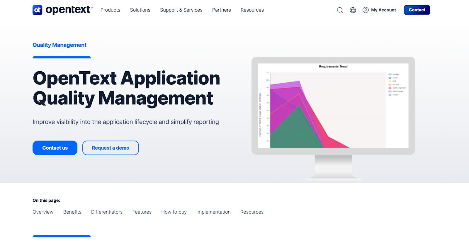
OpenText's Application Lifecycle Management suite represents the gold standard for comprehensive, AI-powered test management and functional testing across diverse enterprise applications.
This platform has evolved from traditional test management into a complete quality ecosystem that supports both legacy systems and modern cloud-native architectures.
URL: https://www.opentext.com/products/application-quality-management
Key Features:
- AI-powered test optimization that automatically identifies redundant test cases and recommends coverage improvements
- End-to-end traceability linking requirements through test execution to defect resolution with full audit trails
- Cloud-based QA tools integration supporting on-premises, cloud, and hybrid enterprise environments
- Advanced analytics and reporting providing executive dashboards and compliance documentation
- Integration with 200+ tools including popular CI/CD platforms, IDEs, and enterprise systems
- Enterprise regression testing tools and UFT One's codeless automation enabling both technical and non-technical team members to create robust test scripts
Best for: Organizations requiring robust, auditable testing processes with extensive support for legacy systems while transitioning to modern DevOps practices. Particularly strong for highly regulated industries like finance, healthcare, and government.
2. Tricentis Tosca Continuous Testing Platform
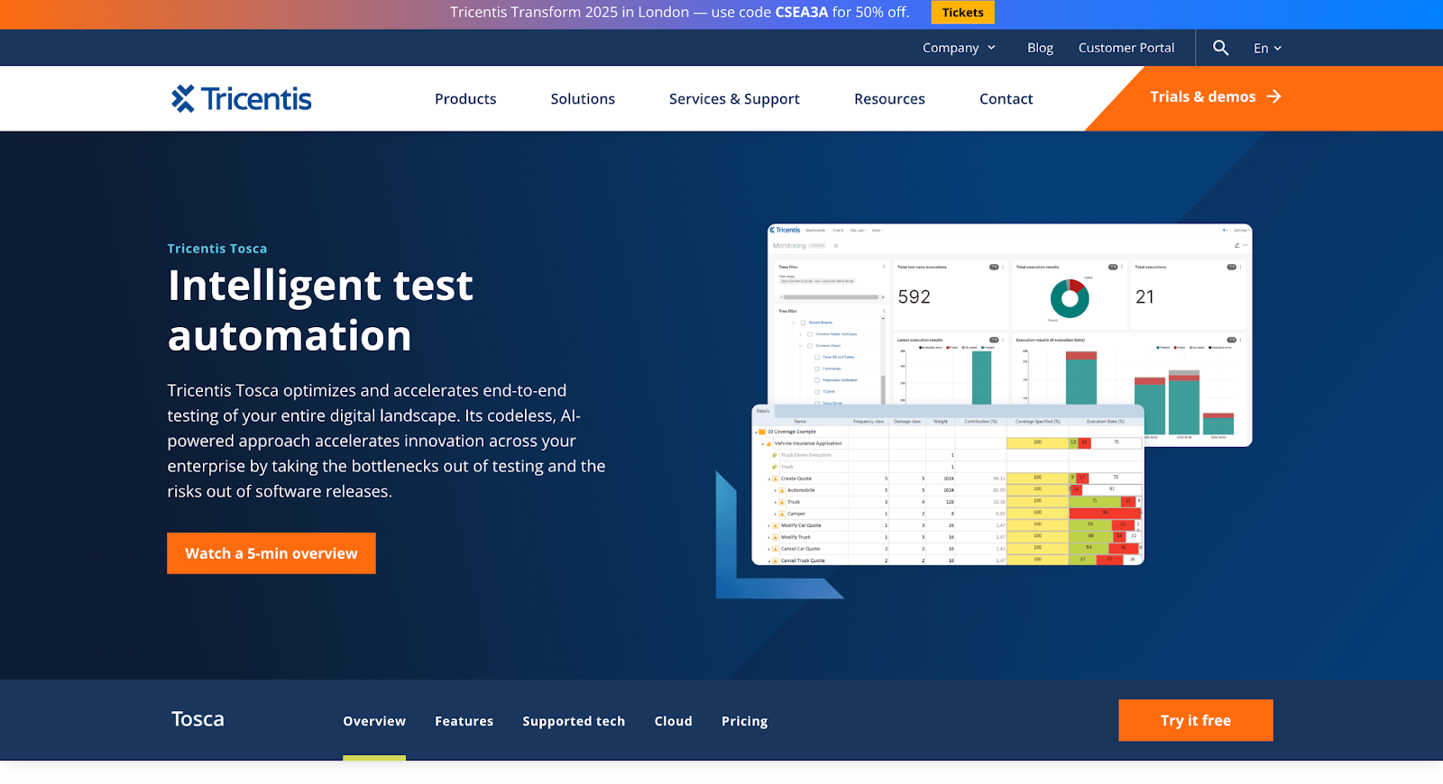
Tricentis Tosca has revolutionized enterprise test automation with its model-based approach that eliminates the traditional maintenance burden of script-based testing.
This platform enables organizations to achieve continuous testing at enterprise scale without requiring extensive coding expertise.
URL: https://www.tricentis.com/products/automate-continuous-testing-tosca
Key Features:
- Model-based test automation that automatically adapts to application changes, reducing maintenance by up to 90%
- Risk-based testing optimization using AI to prioritize test execution based on business impact and change analysis
- API and UI testing integration providing comprehensive end-to-end enterprise QA coverage in a single platform
- Real-time test impact analysis showing exactly which tests need to run based on code changes
- Enterprise-grade scalability supporting parallel execution across thousands of test cases
- Built-in test data management with synthetic data generation and data privacy compliance features
Best for: Enterprises aiming for rapid, scalable test automation within Agile and DevOps environments, particularly organizations struggling with test maintenance overhead and seeking faster time-to-market.
3. SmartBear TestComplete and Quality Suite
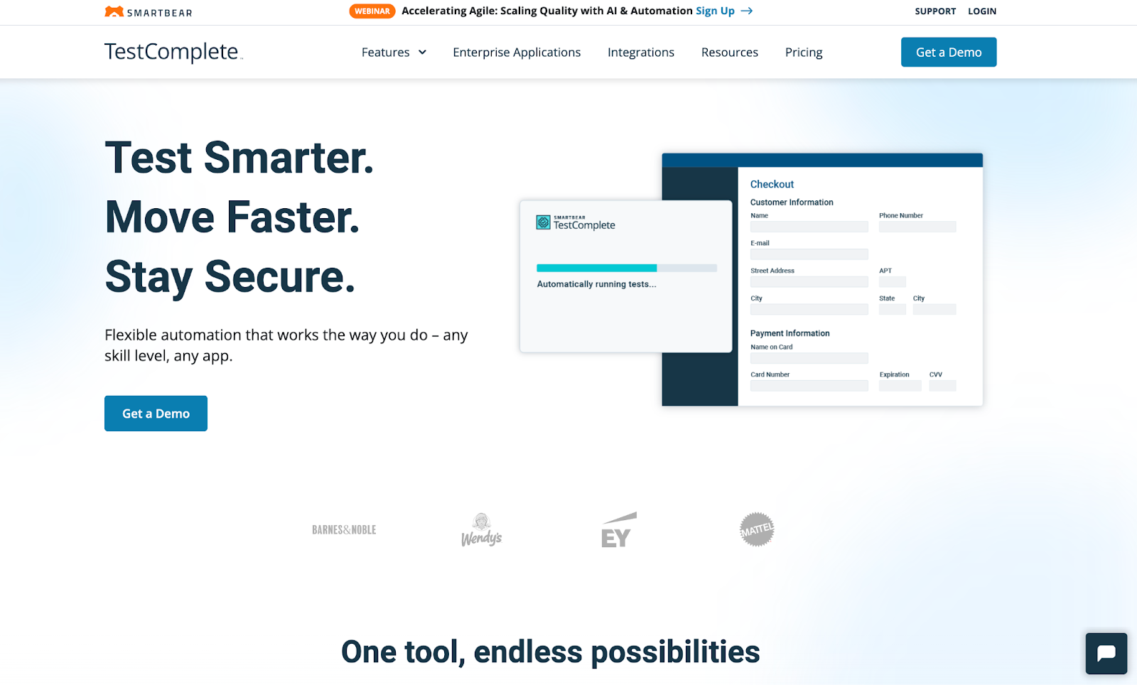
SmartBear's TestComplete strikes the perfect balance between powerful automation capabilities and user-friendly design, making it accessible to teams with varying technical expertise.
The platform's flexibility in supporting both scriptless and scripted approaches makes it particularly valuable for diverse enterprise teams.
URL: https://smartbear.com/product/testcomplete/
Key Features:
- Hybrid testing approach supporting keyword-driven, data-driven, and scriptless test creation methods
- Cross-platform support for desktop, web, and mobile applications with unified test management
- Advanced object recognition using AI-powered visual matching and self-healing locators
- Parallel and distributed testing capabilities for faster test execution across multiple environments
- Integration ecosystem connecting seamlessly with popular CI/CD tools and test management platforms
- Comprehensive reporting with detailed test execution analytics and failure diagnostics
Best for: Teams seeking flexible, easy-to-use UI testing solutions with broad technology support, particularly organizations with mixed skill levels and diverse application portfolios.
4. Keysight Eggplant Test Automation
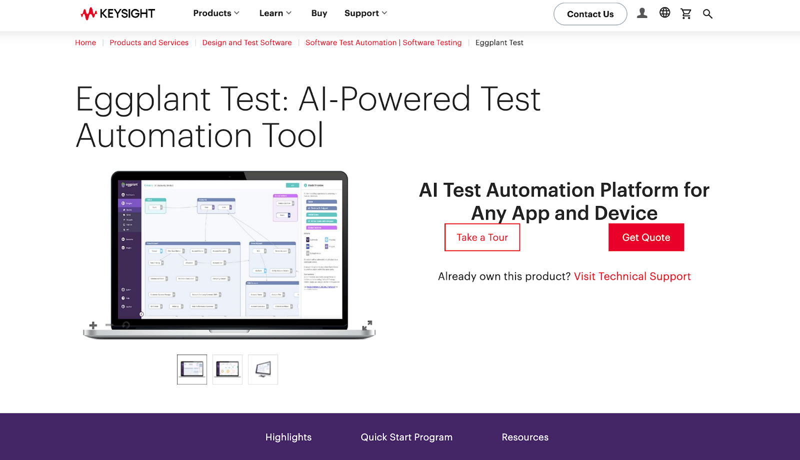
Keysight Eggplant represents a paradigm shift in enterprise testing through its user-centric, AI-driven approach that simulates real user interactions rather than relying on traditional script-based automation.
This platform excels in testing complex systems where conventional automation tools struggle.
URL: https://www.keysight.com/us/en/products/software/software-testing/eggplant-test.html
Key Features:
- Image-based automation that tests applications exactly as users see them, independent of underlying code structure
- AI-powered user journey optimization that discovers the most efficient paths through applications
- Cross-platform and cross-device testing supporting any technology stack without requiring SDK integration
- Intelligent test creation using machine learning to generate test scenarios based on user behavior patterns
- Performance testing for large systems including network conditions, device variations, and accessibility testing
- Real-world simulation capabilities combining functional and performance validation in unified workflows
Best for: Testing complex, user-centric applications where traditional scripting is challenging or impractical, particularly for organizations prioritizing user experience validation and accessibility compliance.
5. Katalon Studio and Platform
Katalon has emerged as a compelling alternative for enterprises seeking comprehensive testing capabilities without the traditional enterprise tool complexity.
The platform's low-code approach and integrated ecosystem make it particularly attractive for organizations prioritizing rapid deployment and cost efficiency.
URL: https://katalon.com/katalon-platform
Key Features:
- Unified testing platform supporting web, API, mobile, and desktop testing with shared test assets and reporting
- Low-code automation enabling faster test creation through intuitive visual interfaces and reusable components
- Native CI/CD integration with pre-built plugins for popular DevOps tools and cloud platforms
- Smart test execution using AI to optimize test runs and provide predictive analytics on test stability
- Collaborative test management with real-time team collaboration features and centralized test asset management
- Scalable cloud execution supporting parallel testing across global infrastructure with automatic scaling
Best for: Organizations seeking a cost-effective, all-in-one testing platform with quick setup and deployment, particularly mid-market enterprises balancing comprehensive testing needs with budget constraints.
What Are the Seven Basic Quality Tools (Techniques)?
The seven basic quality tools are:
- Stratification
- Histogram
- Check sheet
- Cause and effect diagram
- Pareto chart
- Scatter diagram
- Control chart
These tools were first introduced by Kaoru Ishikawa, a Japanese quality expert and the father of quality circles. He believed these tools could be used by anyone in the organization, not just quality specialists, to improve quality and productivity.
He also emphasized the importance of involving all the stakeholders in the quality improvement process, from top management to frontline workers.
Let’s take a closer look at each of the seven essential quality tools and see how they can help you with your QA process.
Stratification
Stratification is a technique that involves dividing a set of data into smaller groups or categories based on some common characteristics or attributes.
This can help you reveal patterns, trends, or relationships that might be hidden or obscured in the whole data set. Stratification can also help you identify the sources of variation or the factors that influence the quality of your project outputs.
For example, you want to analyze the customer satisfaction ratings of your project deliverables. You can stratify the data by different criteria, such as product type, customer segment, delivery date, or feedback channel. This can help you see which products, customers, or delivery methods have the highest or lowest satisfaction ratings and why.
To use stratification, you need to:
- Collect data on the quality characteristic or parameter that you want to analyze.
- Identify the criteria or factors you want to use to stratify the data.
- Sort the data into subgroups or categories based on the criteria or factors.
- Compare and analyze the subgroups or categories to find patterns, trends, or relationships.
You can use a spreadsheet or a table to record and display the stratified data. You can also use graphs or charts, such as pie charts, bar charts, or line charts, to visualize the data and make it easier to understand.
Histogram
A histogram is a visual representation illustrating the frequency distribution of a dataset. It takes the form of a bar chart, presenting the number or percentage of observations within distinct intervals or bins. This graphical tool aids in discerning the data's shape, spread, and central tendency, while also facilitating the identification of outliers, gaps, or clusters within the dataset.
For example, you want to analyze the defect rates of your project deliverables. You can use a histogram to show how many deliverables have zero defects, one defect, two defects, and so on. This can help you see the distribution of faults and the variation in quality.
To use a histogram, you need to:
- Collect data on the quality characteristic or parameter that you want to analyze.
- Determine the number and size of the intervals or bins you want to group the data. You can use a formula, such as the square root of the number of observations, or a rule of thumb, such as the 2 to the k rule, to decide the number of bins. You can also use a software tool like Excel to create the containers automatically.
- Count the number or percentage of observations that fall within each bin.
- Create a bar chart with bins represented on the horizontal axis and frequency or percentage on the vertical axis. Ensure that the bars are adjacent to each other and maintain equal width.
You can also add a line or a curve, such as a normal distribution curve, to the histogram to compare the actual data with a theoretical or expected distribution.
Cause and Effect Diagram
A cause and effect diagram, alternatively referred to as a fishbone diagram or Ishikawa diagram, serves as a visual instrument aiding in identifying and analyzing potential causes behind a quality problem or effect.
Functioning as a brainstorming tool, it organizes ideas into categories and subcategories. This diagram proves valuable in pinpointing the root causes of a quality issue, contributing to effective preventive measures.
For example, you want to analyze why your project deliverables are delayed. You can use a cause-and-effect diagram to list all the potential factors affecting the delivery time, such as people, materials, methods, machines, environment, and measurement. You can then drill down into each factor and find the specific causes responsible for the delay.
To use a cause and effect diagram, you need to:
- Specify the quality problem or effect for analysis and record it on the right side of a sizable sheet of paper or a whiteboard.
- Draw a horizontal line from the problem or effect and label it as the spine of the fish.
- Identify the major categories or factors that can influence the problem or effect, draw diagonal lines from the spine, and label them as the bones of the fish. You can use generic categories, such as the 6Ms (manpower, machinery, materials, methods, measurement, and mother nature) or specific types relevant to your project.
- Brainstorm the possible causes or sub-factors that belong to each category or factor, draw sub-branches from the bones, and label them as the sub-bones of the fish. You can use the 5 Whys technique or other methods to investigate the causes.
- Analyze the diagram and prioritize the most critical or frequent causes that must be addressed.
You can use software tools like Excel, PowerPoint, or Visio to create and edit the cause-and-effect diagram. You can use colors, symbols, or ratings to highlight or rank the causes.
Pareto Chart
A Pareto chart is a graphical tool that helps you prioritize the most important or significant causes of a quality problem or effect. It is a type of bar chart that shows the frequency or percentage of each cause in descending order, along with a cumulative line that shows the total rate of the reasons. Utilizing a Pareto chart facilitates the application of the Pareto principle, commonly recognized as the 80/20 rule, asserting that 80% of the effects stem from 20% of the causes.
For example, you want to analyze which types of defects are causing the most rework or waste in your project. You can use a Pareto chart to show how many defects are caused by each type, such as design, manufacturing, testing, or packaging. This can help you see which defects are the most frequent or severe and need to be addressed first.
To use a Pareto chart, you need to:
- Collect data on the quality problem or effect and the possible causes you want to analyze.
- Count the frequency or percentage of each cause and rank them in descending order.
- Draw a bar chart that shows the causes on the horizontal axis and the frequency or percentage on the vertical axis. Ensure the bars are aligned from left to right according to their rank.
- Draw a line chart showing the cumulative percentage of the causes on the same vertical axis. Start from the leftmost bar and add the share of each bar to the previous one until you reach 100%.
- Draw a vertical line at 80% on the cumulative percentage axis and identify the causes on the left side of the line. These are the vital few causes that account for 80% of the problem or effect.
You can use a software tool like Excel to create and edit the Pareto chart. You can also use colors, symbols, or labels to highlight or annotate the causes.
Scatter diagram
A scatter diagram, also known as a scatter plot or a scatter graph, is a graphical tool that helps you explore the relationship or correlation between two variables or factors that affect the quality of your project outputs.
It is a plot illustrating the values of one variable on the horizontal axis and another on the vertical axis. Each data pair is depicted as a point on the plot. A scatter diagram aids in assessing the correlation between the two variables, revealing whether it is positive, negative, or non-existent and indicating the strength or weakness of the correlation.
For example, you want to analyze how the temperature and the humidity affect the performance of your project deliverables. You can use a scatter diagram to show the temperature and humidity values for each deliverable and see if there is a pattern or trend in the data. This can help you determine if there is a causal or an influential relationship between the two variables and how to control or optimize them.
To use a scatter diagram, you need to:
- Collect data on the two variables or factors that you want to analyze.
- Plot the values of one variable on the horizontal axis and the importance of another variable on the vertical axis. Ensure that the axes' scales and ranges are appropriate and consistent.
- Draw a point for each pair of values on the plot. You can use different colors, shapes, or sizes to distinguish or group the points.
- Examine the shape, direction, and density of the points on the plot to discern whether there is a nonlinear, linear, or no correlation between the two variables. Additionally, consider employing a line or curve, such as a regression line or a curve of best fit, to illustrate the most accurate approximation of the relationship between the two variables.
You can use a software tool like Excel to create and edit the scatter diagram. You can also use labels, legends, or annotations to explain or emphasize the points.
Control chart
A control chart, also known as a Shewhart chart or a process behavior chart, is a graphical tool that helps you monitor and control the variation or stability of a process or a system that affects the quality of your project outputs.
It is a type of line chart that shows the values of a quality characteristic or parameter over time, along with a center line that shows the average or target value and two control limits that show the upper and lower boundaries of the variation. A control chart can help you see if the process or the system is in control or out of control and if there are any special or common causes of variation.
For example, suppose you want to monitor and control the cycle time or the duration of your project activities. You can use a control chart to show the cycle time values for each activity and see if they are within the control limits. This can help you detect and eliminate any abnormal or assignable causes of variation, such as errors, defects, or changes, and maintain or improve the quality and efficiency of your project.
To use a control chart, you need to:
- Collect data on the quality characteristic or parameter that you want to monitor and control over time.
- Calculate the center line, which is usually the mean or the median of the data, and the control limits, which are usually based on the standard deviation or the range of the data. You can use different formulas or methods, such as the X-bar and R chart, the P chart, or the C chart, depending on the type and the distribution of the data.
- Draw a line chart that shows the values of the quality characteristic or parameter on the vertical axis and the time or the sequence on the horizontal axis. Make sure that the scales and the intervals of the axes are appropriate and consistent.
- Draw the center line and the control limits on the same chart and label them accordingly.
- Observe the points on the chart and see if they are within or outside the control limits or if they show any patterns or trends that indicate a lack of control or stability. You can use different rules or tests, such as the Western Electric or Nelson rules, to identify the signals or outliers.
You can use a software tool like Excel to create and edit the control chart. You can also use colors, symbols, or annotations to highlight or explain the points.
Need Help Improving Your QA Function?
When software quality directly impacts business outcomes, the right QA strategy is a technical consideration AND a competitive advantage that can make or break your digital transformation initiatives.
MSH specializes in helping technology leaders build robust enterprise software quality assurance and testing capabilities that scale with business growth.
Our approach combines deep technical expertise with proven methodologies, ensuring your QA function becomes an enabler of rapid, reliable software delivery rather than a bottleneck.
Whether you're implementing new enterprise quality assurance tools, scaling existing QA processes, or building testing centers of excellence, MSH provides the strategic guidance and specialized talent needed to transform your software quality outcomes.
.jpeg)